Logo Design
Logos are core to establishing brand identity and creating a recognizable icon. This page is dedicated to my various logo designs that I have created for several projects.
The logo above is for my Luminova Lightbulb Packaging Project. The fictional Luminova Corporation deals with electricity and lightbulb distribution, so I incorporated yellow to portray the emission of light.

Trail Blitz is a fictional company that produces magazines on natural locations to visit. I used earthy colors and directional arrows similar to a compass as the wording of the logo inspires travel and movement. I was provided a different logo for the final Trail Blitz Greenspace Booklet Design.
Salt Quest Papercraft Collectibles, or Salt Quest Pcc for short, is an original branded line of papercraft build-it-yourself collectibles. Marketed towards ages 11-14, the logo was designed to feature several of the characters from the brand. Rather than making this project with a specific or fictional company in mind, the project was created out of my own personal interests.
Berry Kane is a fictional ice cream company located in England. Because the company prides its heritage and high-class appearance, an iconic clocktower is used along with regal colors. Berry Kane as a company spans across several of my projects, such as my Berry Kane Ice Cream Tub and Truck Designs and the Berry Kane Company Style Guide.
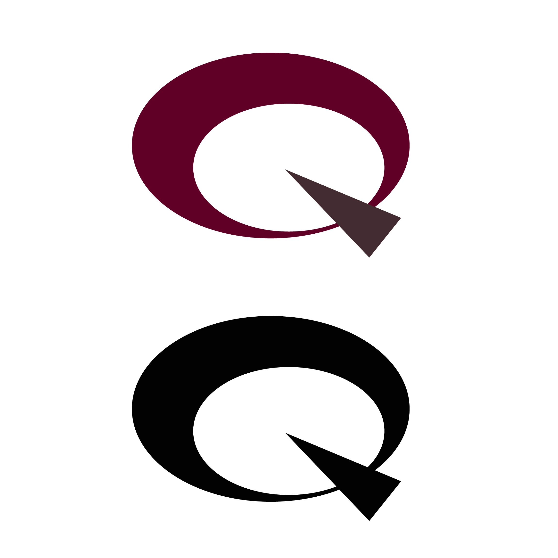
Quester is a fictional book publishing company. To account for the many locations stories can take place in, the logo abstractly resembles a globe with an arrow pointing to a location. Originally made for my The Super Always Rings Twice Book Design Project, a different logo design was ultimately provided and used on the project.
