Type and letter placement is very important when relaying information to the reader. These projects are focused on presenting
information in creative or functional forms.
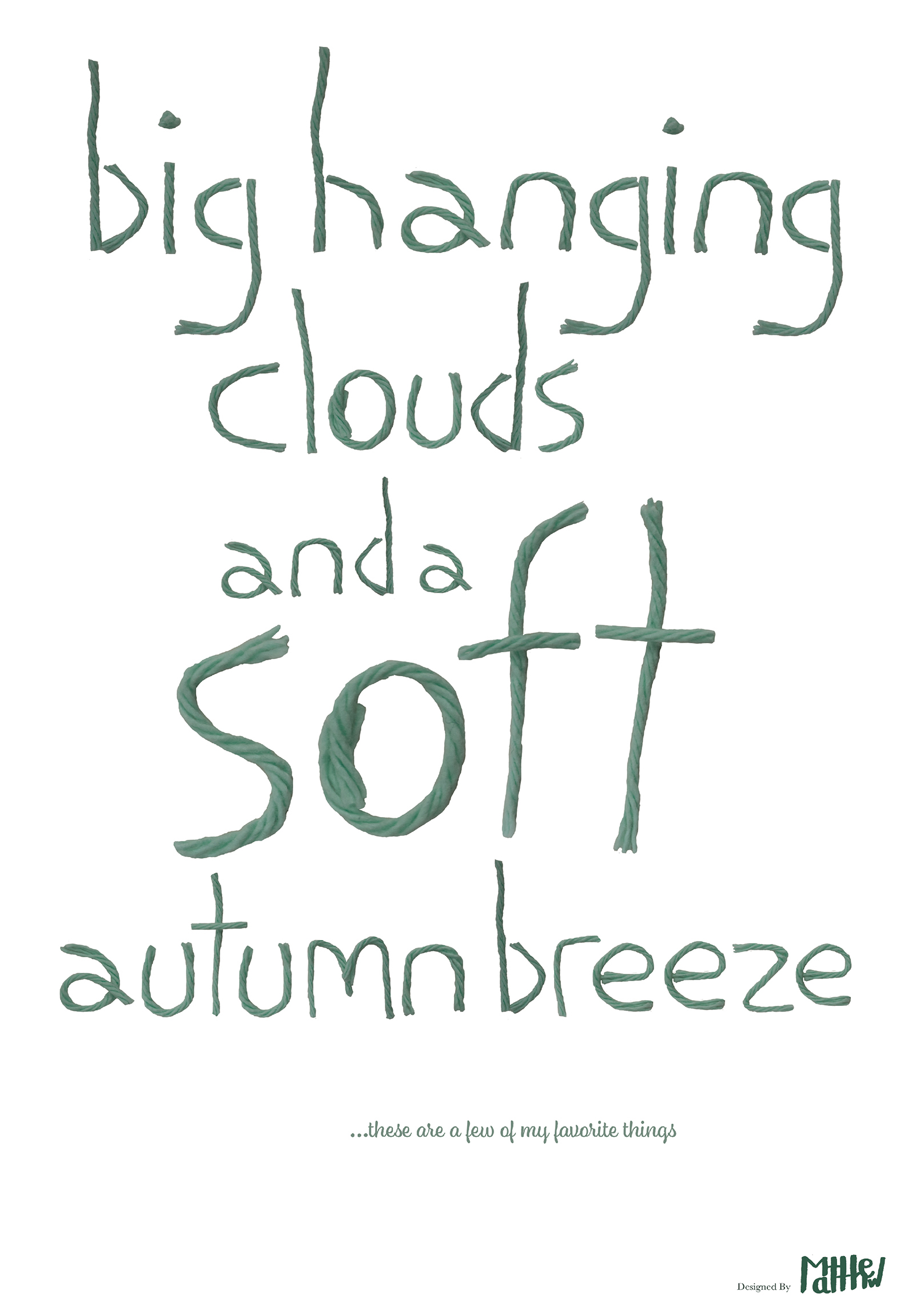
The poster above is based on the song 'My Favorite Things’ and lists some things I personally enjoy. The words are made from yarn,
arranged, photographed, then digitally repositioned.
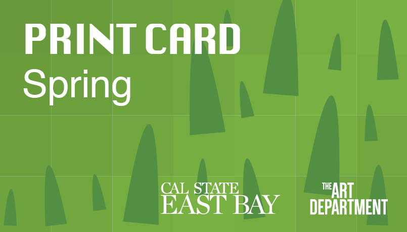
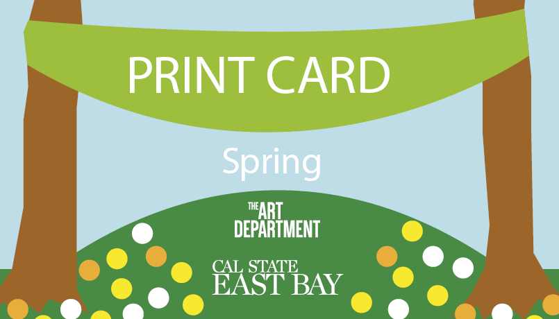
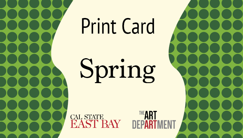
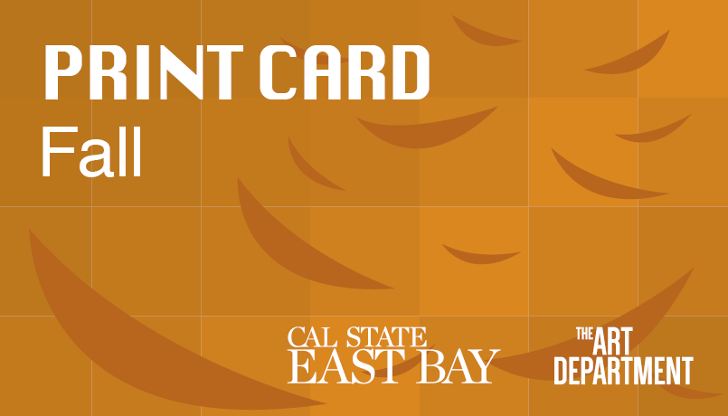
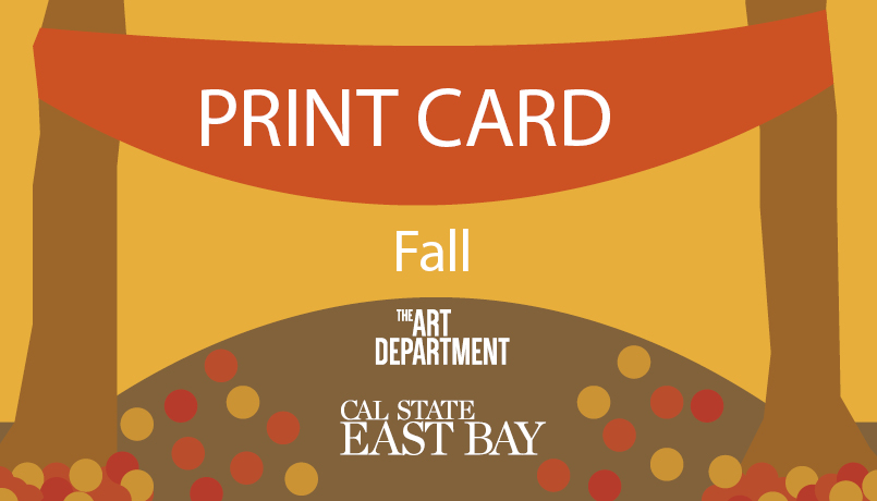
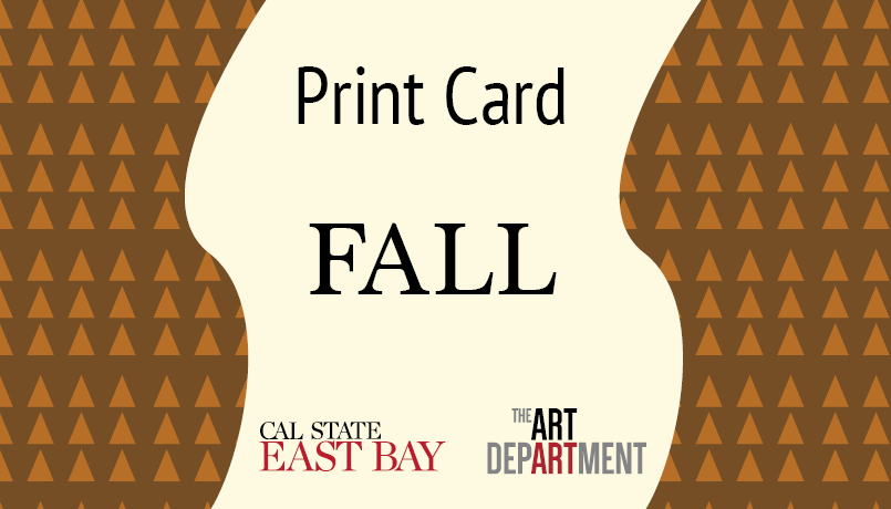
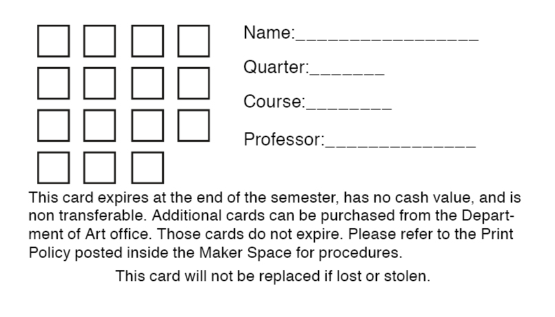
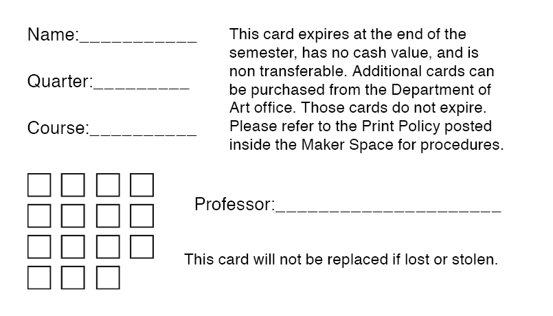
Above are designs for Cal State East Bay’s Fall and Spring Print Cards. Print Cards are used to print content at
the college’s Print Lab. Each card has a Fall and Spring variation, as well as several designs for the back side
of the card. These designs were ultimately not used by Cal State East Bay.
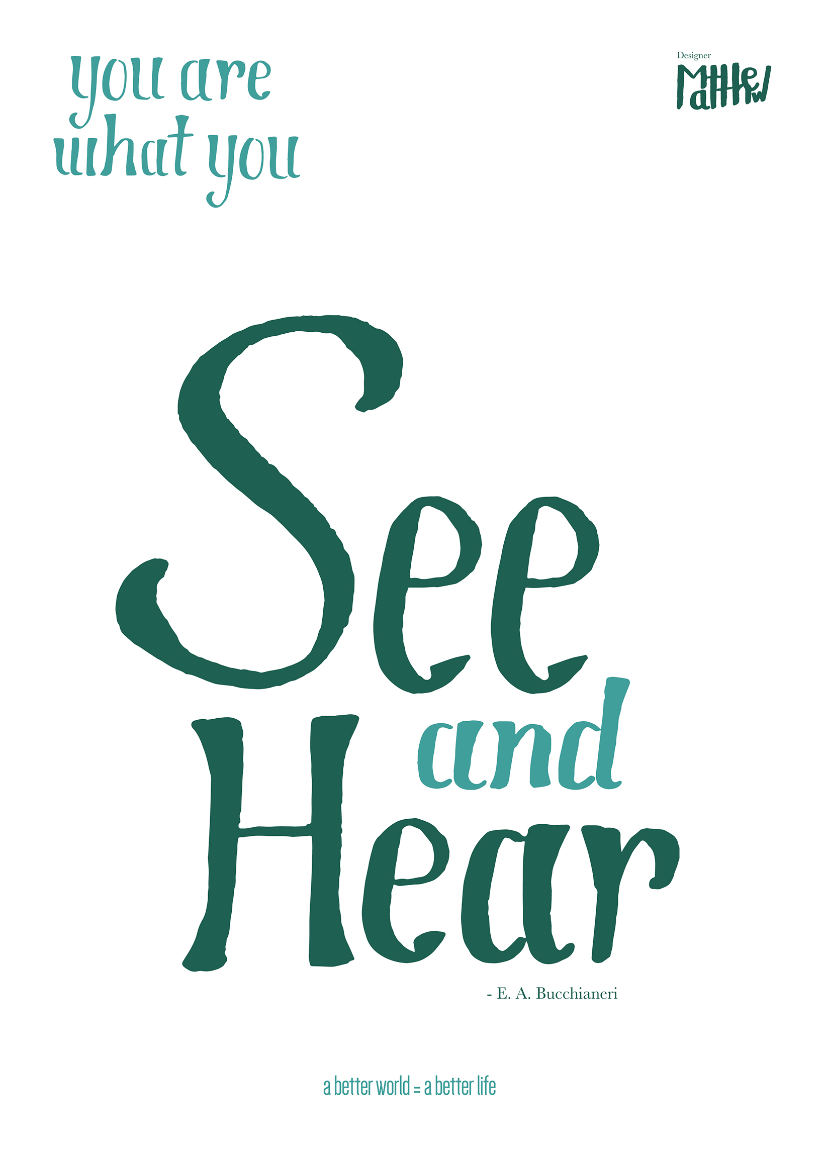
The goal of this project was to create a poster with hand-drawn lettering, using one of several quotes as a source.
The letters were hand-drawn with a marker, then scanned and edited digitally.
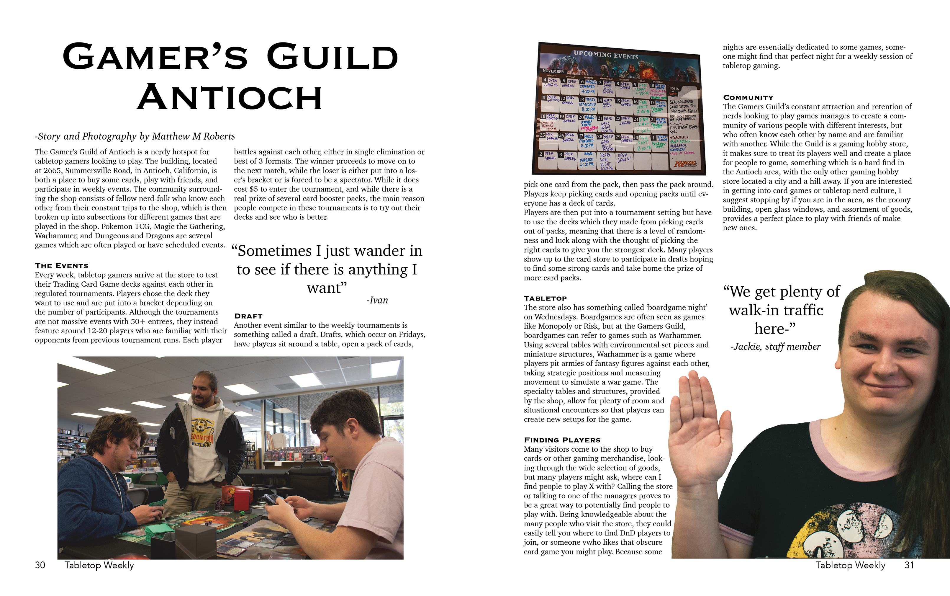
This project is a spread for a fictional magazine. The spread features approved photography of a real location and business. While the location
is no longer in business, this spread aims to bring attention to the community and encourage potential participation on the reader.